Podcast: Play in new window | Download (Duration: 15:03 — 21.1MB) | Embed
Subscribe: Spotify | Amazon Music | Email | TuneIn | Deezer | RSS | More
If you dislike financial reports and you are wondering how to make a line graph in Google Sheets.
I’ve got just the right step-by-step solution for you using one of the easiest online line graph makers.
Taking a bunch of data and turning it into a graph can be very helpful for your business.
However, if you have a history of falling asleep during financial management presentations.
Or your eyes glaze over whenever you see a complex spreadsheet.
Then I can totally relate to your allergy to data analysis.
For example, a number of years ago, I was doing a postgraduate course in business and IT.
The class was big and it took place two evenings a week.
I went into the class with the sole intention of staying awake.
No matter how hard I tried I always ended up falling asleep during the class.
If only there was a way to create line graphs in Google sheets on the fly.
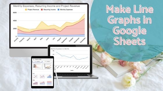
In this post, you’ll learn how to create line graphs in Google Sheets and the best ways to use them to become more successful.
Best Uses of Line Graphs
Before I dive into showing you how to create your precious line graph.
Let’s spend some time looking at when to use them.
Line graphs are best used to show information that changes over time.
So, a few good use cases include a change in:
- Temperature
- Income or Revenue
- Depreciation values
- Energy use (Electricity + Heating)
- Expenditure
- Business growth
As you can see there are many instances where creating a line graph will benefit you and your business.
It’ll help you track your performance over time.
One key aspect of creating line graphs is that it’ll also help you with budgeting.
A cool aspect of line graphs is that it comes in different types.
Let’s spend some time looking at line graph types so you’ll know which one to use when.
Types of Line Graphs
Did you know that there are 3 different types of line graphs? Of course, there are different types of graphs apart from line graphs.
These 3 types include:
- Simple line graph
- Multiple line graph
- Compound line graph
To help you understand the differences among these 3 line graphs let’s look at each one in turn.
Simple Line Graph
As the name suggests a simple line graph is the type of graph that can be plotted using a single line.
It shows the relationship between two variables. For example, time vs temperature or time vs money.
Multiple Line Graph
What makes a multiple line graph different is that this graph type is plotted with two or more lines.
It is often used to display two or more variables over a specific period of time. For example, income + expenditure over the same time period.
Compound Line Graph
Just when you thought a multiple line graph was complex the compound line graph trumps them all.
Well, a compound line graph breaks the data down into different types.
This one isn’t as easy to explain without showing you a visual example. So, I’ll show you one later in this resource.

Components of a Line Graph
Now that you know about the different types of line graphs.
Let’s spend some time looking at the different components that make up a line graph.
- X-axis
- Y-axis
- Title
- Scale
- Labels
- Line
Do you remember those days in school where you could never remember which axis was the “x” and which was the “y”?
Annoying right?
X-axis
The x-axis is the horizontal scale of the graph where you determine the time increments.
Is your time going to be in seconds, minutes, hours, days, weeks or months?
Enter the data for your x-axis in the first column.
Y-axis
When it comes to the y-axis, it is the vertical scale where you determine the data that you are measuring against time.
This data could be energy, revenue, expenditure, depreciation or even savings.
Title
This may seem obvious but having a title for your graph is super important.
The reason is that it tells anyone what the graph is about.
Labels
Have you ever seen a graph without data labels? What did you think the items on both axes represented.
While a title is important having the labels for each item is equally important to understand the data.
Scale
As you can imagine a scale is the one thing that keeps the items on the graph consistent over a specific time period.
Imagine having time on the x-axis measured in minutes, months and years. It will be very confusing.
Line
Finally, a graph without a line will leave everyone confused since the data relation would be missing.
In fact, without a line, you’ll just have data in two columns.
Gather the data
One of the most important aspects of plotting a line graph is to have the data ready.
By this I mean, you probably have the data in a bank statement somewhere or in a dozen envelopes.
Now is a good time to gather the data together to ensure that you have what you need.
I guess the more important step is deciding what data you’ll like to plot in the first place.
Let’s say you want to create a graph to track business expenses.
Take a look at your expenses over the last 12 months.
Write down the total expenses for each month in order to ensure that you don’t have any gaps.
Once you have all your data ready to go.
It’s time to head over to Google Sheets.
How to Make a Line Graph in Google Sheets
Head over to Google Docs using docs.google.com and log into your account. Use the same logins for Gmail to get into your account.
If you don’t have a Google account, it is easy to create one.
Maybe you have several Gmail accounts like me so be sure to choose the right account when logging in.
After logging in you’ll be brought to a view that looks similar to the one below.
Step 1
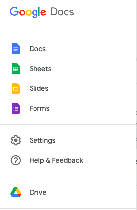
Click on the hamburger menu on the top-left and click on Sheets.
Start a new Google spreadsheet by clicking on the blank option as shown in the screenshot below.
Step 2
Give your spreadsheet a memorable name.
Single Line Graph
Step 3
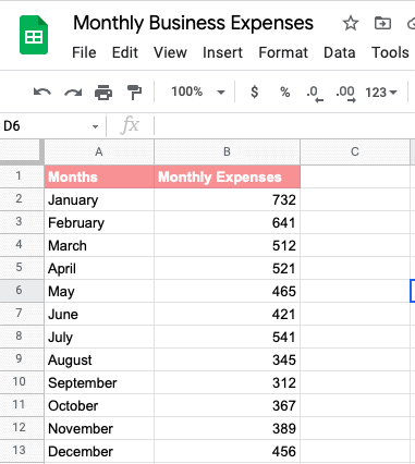
Name each column based on the data associated with it.
Your first column name corresponds to the horizontal axis title.
While the second column name will be your vertical axis title.
So, for example, if you’ll be using the months of the year, label it months or the year that it represents.
The y-axis column will then be labelled monthly expenses. You can even change the font size and font style to match your brand.
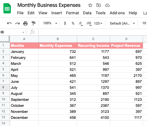
Enter all the data for each column, once your data columns are completed it should look like my example below.
Step 4
This is going to be the easiest step ever.
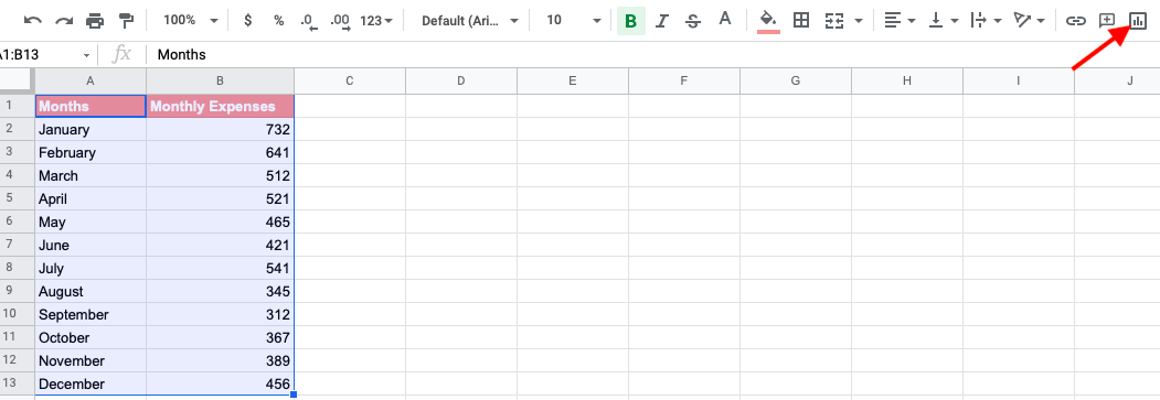
Highlight all the data range from the first cell in your sheet to the last.
Click the “insert chart” button or chart icon on the top right corner as shown in the screenshot below.
What happens next is going to knock your socks off.
Almost like sprinkling fairy dust, a simple line chart will appear in your Google Sheet.
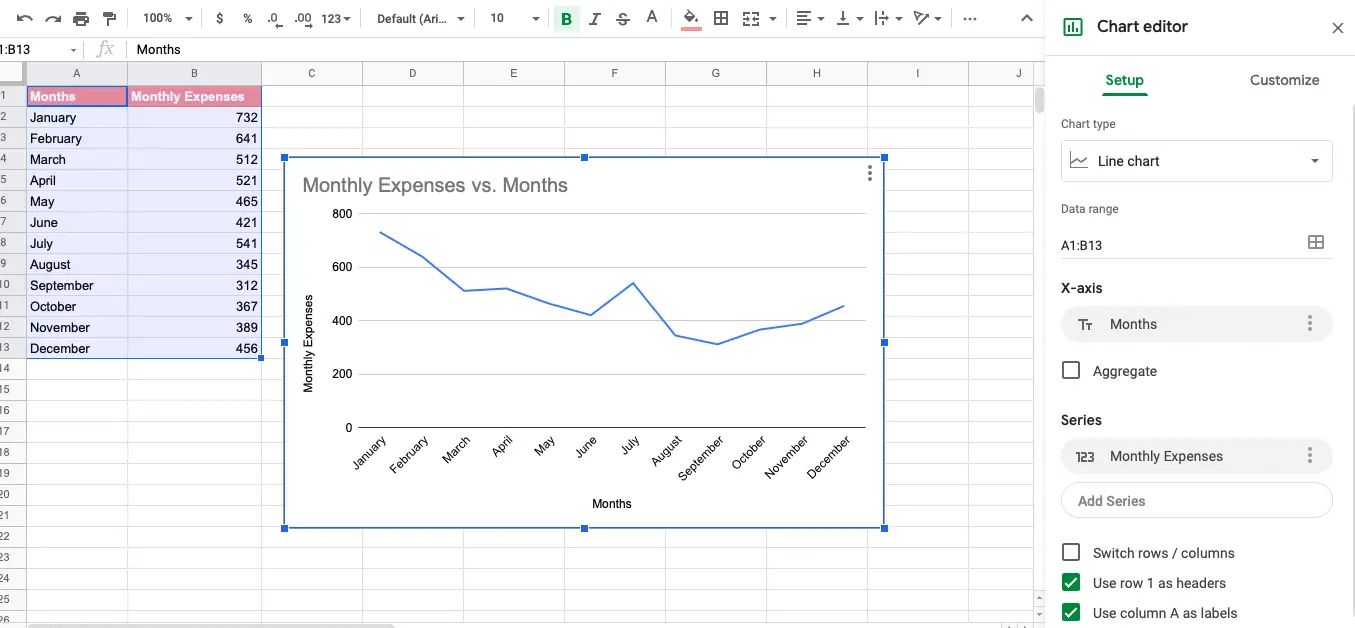
On the right-hand side, you also have access to the chart editor where you can turn your line graph into a different chart style like a pie chart.
Multiple Line Graph
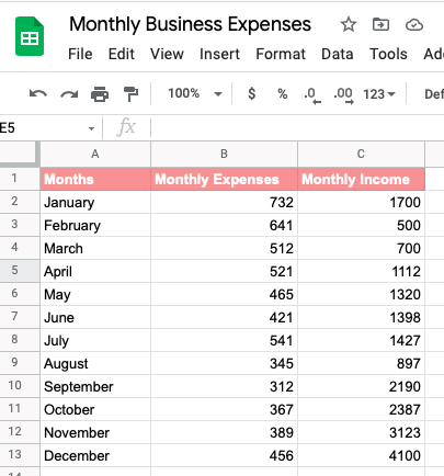
Well, what if you wanted to include one line for expenses and another line for income?
Simply head back over to your sheet and enter new values.
Include the name for that column as well as the value of income for each month.
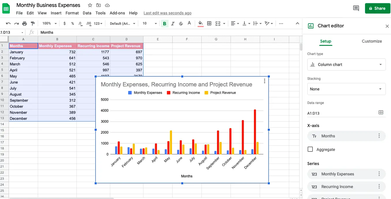
Highlight all three columns which represent the source data and click the insert chart button again.
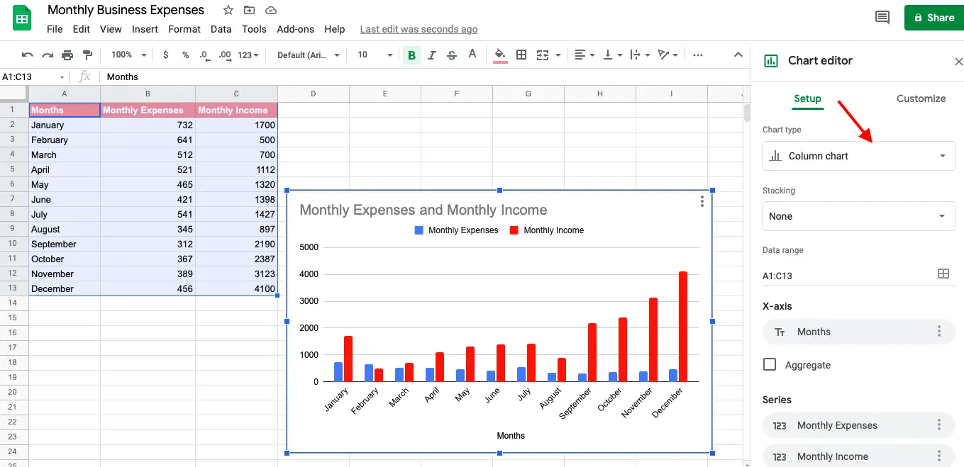
Google Sheets will automatically create a default chart type which is the bar graph.
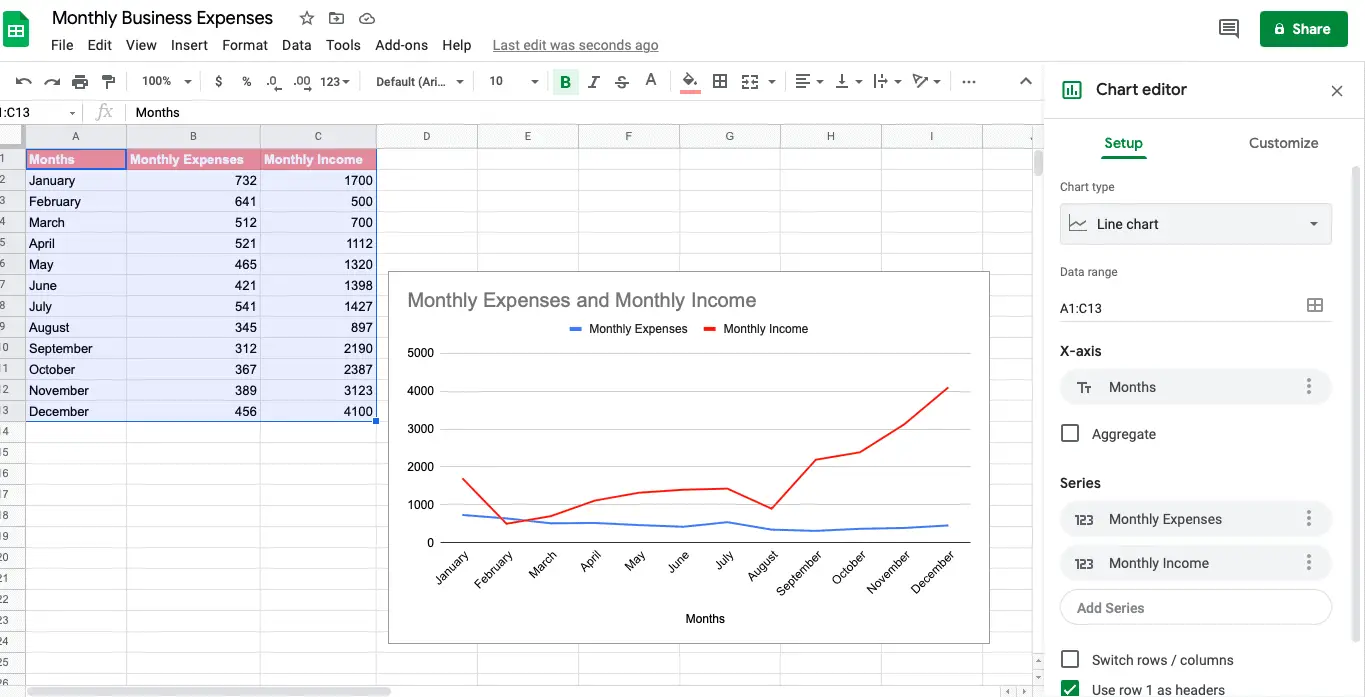
To change it back to a line graph go to the chart type menu or setup tab and select line graph.
Notice that there are many different types of charts that you can use for your data series.
Here’s what mine looks like after I change it. See how you now see a different line representing income.
Of course, if you prefer to see these figures as a bar chart by all means change it to suit your needs.
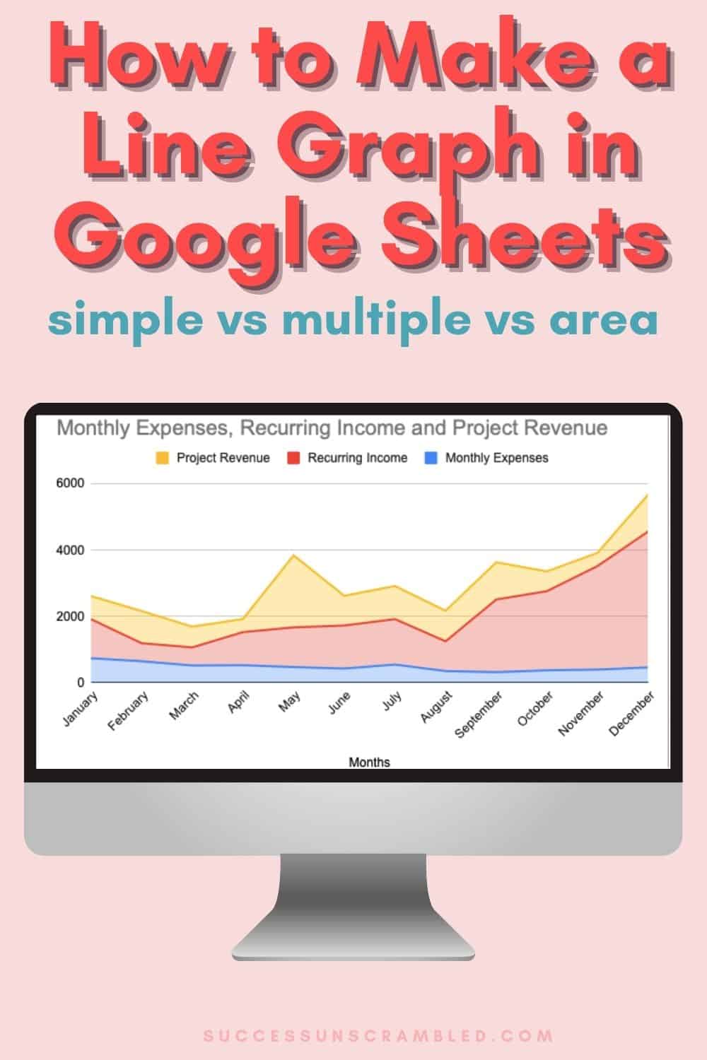
Compound Line Graph
At this point, you are probably wondering what about the 3rd type of graph, the compound line graph.
Well, you’ll need a fourth column of data in order to see how this works.
Let’s say that your income sources come from two different types of work.
The first is recurring revenue or retainers and the 2nd is project-based work.
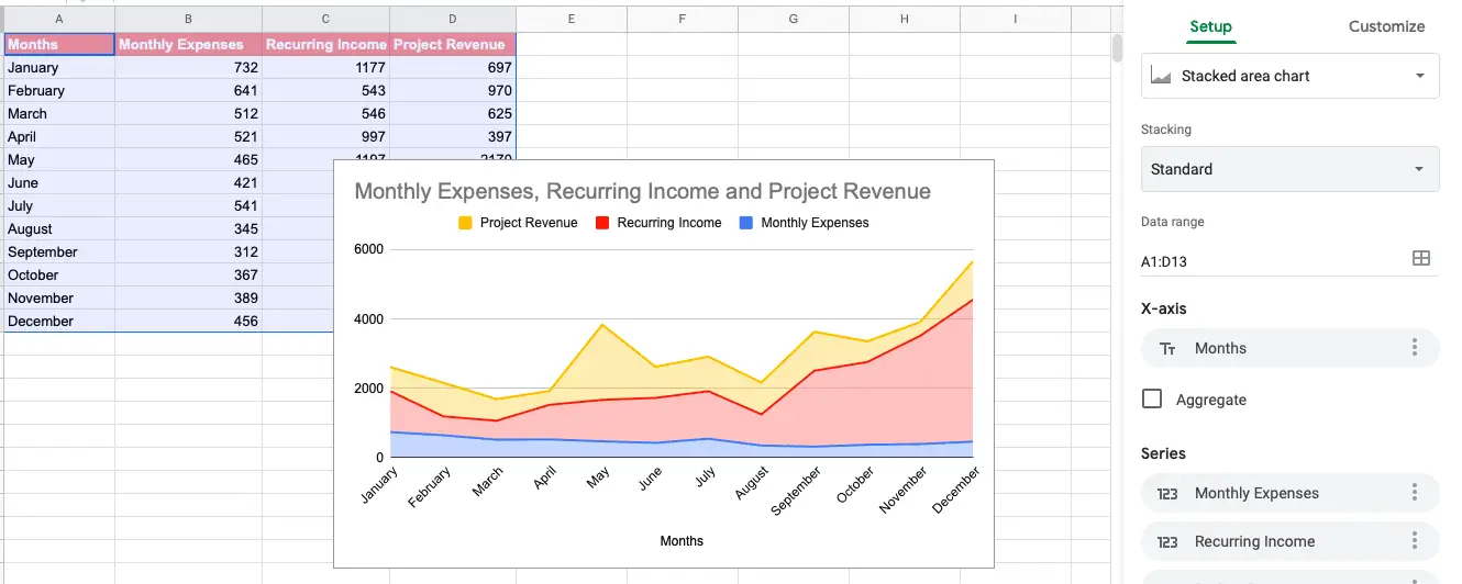
After creating a fourth column with my project-based work this is what my spreadsheet looks like.
When I highlight all the columns and click on “insert chart”. My resulting graph turns out like this one.
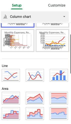
Simply choose the area chart from the chart type drop-down menu.
When you click on the “customize tab” you’ll see that there are many editing options available like:
- changing the font colour
- thickness of the line
- straight lines vs dashed
- axis titles
- chart title
- adjust each series of data
Here’s what mine looks like after making the necessary adjustments.
It resulted in a single chart that is easy to read.
As you can see making a line graph in Google Sheets is dead easy when you have all your data (values, labels and titles) ready to go.
Remember that you have the freedom to enter different values or adjust the type of chart to suit your needs.
Summary
As I mentioned previously, line graphs are an excellent way for any small business owner to track their performance over time.
Looking at raw data in a spreadsheet is not as exciting as seeing it in a graphical format.
Keep all your receipts, invoices and fees to hand in order to keep tabs on your expenses.
One of the best ways to set and achieve goals each quarter is by looking back at past performance.
It is easy to get discouraged when you go through rough patches during the year.
However, looking at all the data using a 10,000-foot view via a line graph helps you to see the big picture.
If you are looking for ways to increase revenue goals over time create a granular graph outlining where leads are coming from.
Over to you, do you make a line graph in Google Sheets?
Announcements
Remember to subscribe to the Success Unscrambled podcast where you will be the first to hear what’s happening in the entrepreneurial and digital marketing world.
Your positive review of this podcast is vital to keeping it alive and running for the next 12 – 24 months so please leave a positive 5-star review for us on iTunes, Spotify or any of your favourite podcast players.
As business owners we can be hard on ourselves when our revenue goes through a rough patch.
What I’ve learned is that it is normal to have months with lower income compared to others.
I started this blog in 2017 because I had a burden on my heart to reduce women illiteracy globally.
Because this is a huge undertaking I have decided to help 1,000 women over the next 10 years to become wildly successful in their online business through simplified marketing strategies.
That way we can build a strong business network of women who can donate 1% of their profit and together we can help reduce women illiteracy worldwide.
Would you like to be part of this movement? Shoot me an email using alvern (at) successunscrambled (dot) com.


20 thoughts on “How to Make a Line Graph in Google Sheets [In 5 Minutes]”
Nice article, a lot of useful info!
Darbas, I’m glad that you found it useful.
This is so clever. I am terrible at stuff like this so definitely going to bookmark at this post.
Natalie, I’m terrible at stuff like this too. Lol!!
It’s really great that you’re helping people to solve the problems that you once faced, for free as well. Whilst I don’t do anything that requires these at the moment, I know there will come a time where these will become live savers for me – or will at least make life a LOT easier for me! – and it’s great to know there are resources such as your blog out there for me to resort to 😊
Indya, these resources are here for when you are ready.
I love the step-by-step nature of this article. Thank you for sharing!
Nkem, I’m so glad that you enjoyed it.
super helpful! my computer doesn’t have the offices so this is a big help for me. Great job
Michael, I’m glad that it was super helpful.
so fast and simple! great guide for people who face issues with it. simple and to the point guide
Lyosha, it is indeed super fast to create.
I am going to bookmark your article in case I need to create a line graph. Your instructions are so clear!
Lori, thanks for the kind compliment.
Oh wow that’s really a very helpful and informative post. I had no clue about line graph till now.
Khushboo, you know what, you learn something new every day.
Interesting! I wasnt aware of the process of making line graphs in Google sheets. Seems easy and simple looking at the steps
Pooja, it is so easy, even a 5-year-old can do it.
I had no idea what a line graph is. I love how you are teaching the readers step-by-step. Thanks for sharing.
Archana, I’m sure there are other names for it other than a line graph.
Comments are closed.